
Carrom Play was one of those casual silent hits for us especially on growing platforms like MX Player, Jio and ever since the recent pandemic we wanted to scale the game and make it feature rich. Its a game where we have been relentlessly working on adding continuous updates. The idea was to keep the game super light which meant we built it from the ground up as a HTML5 game and not develop it using Unity3D that most other studios would pick. This also meant we took a slightly harder route as there is only so much we can cram in without shooting up the size. Nevertheless we wanted a slick and sophisticated visual design for the game despite the instant game nature.
In a traditional sense we began to visualize the Boards and tried several combinations and look. Nothing quite cut it

Heading some where but light years away from what we wanted!
Much better than the first set of direction but this still didnt quite cut it for us
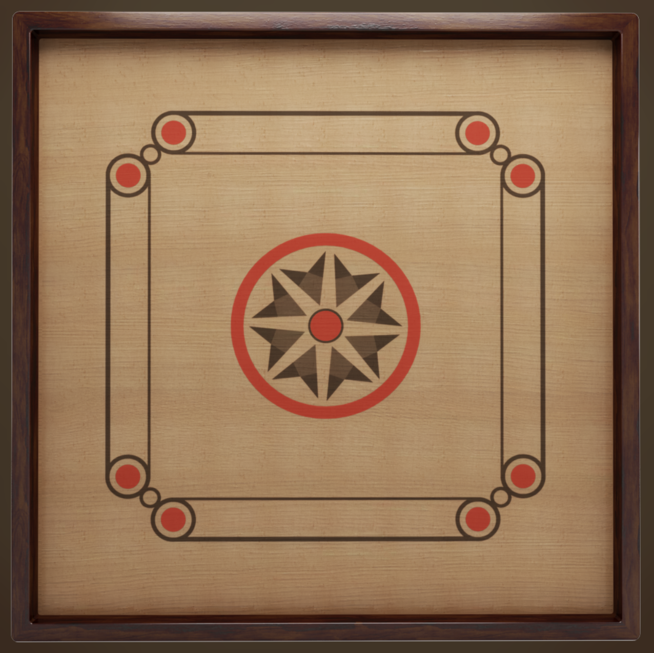
We really wanted a sophisticated treatment to the game where the boards look like they are straight out of a high end game club or a casino. Imagine a carrom board manufactured by a high end luxury fashion brand like Louis Vuitton or Gucci- what sort of materials would they choose, what sort of finish would they go for, the kind of colors they will put in, that’s exactly was the perspective.Not too royal but slick and elite. With that in mind we set out to try some renditions and we then decided to flesh out the board visuals in 3D that allowed us to define the materials and lighting. It really defined the look and paved the way for the overall visuals of the game.

Now we are talking!

We paid attention to the materials, the subtle texture and the lighting.

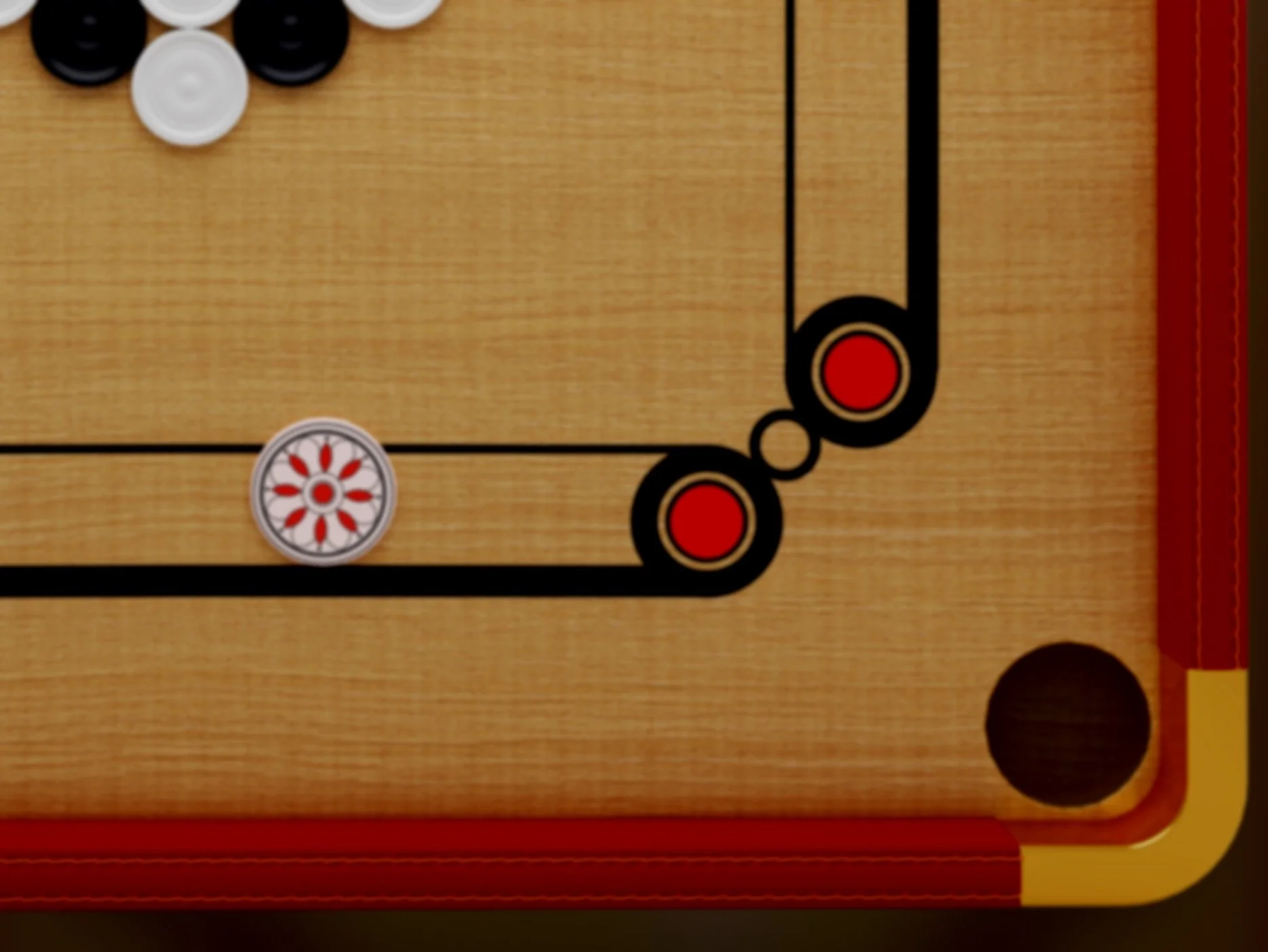
Desired direction we settled on- Golden trim, Frame with Stitched leather for that elite look.
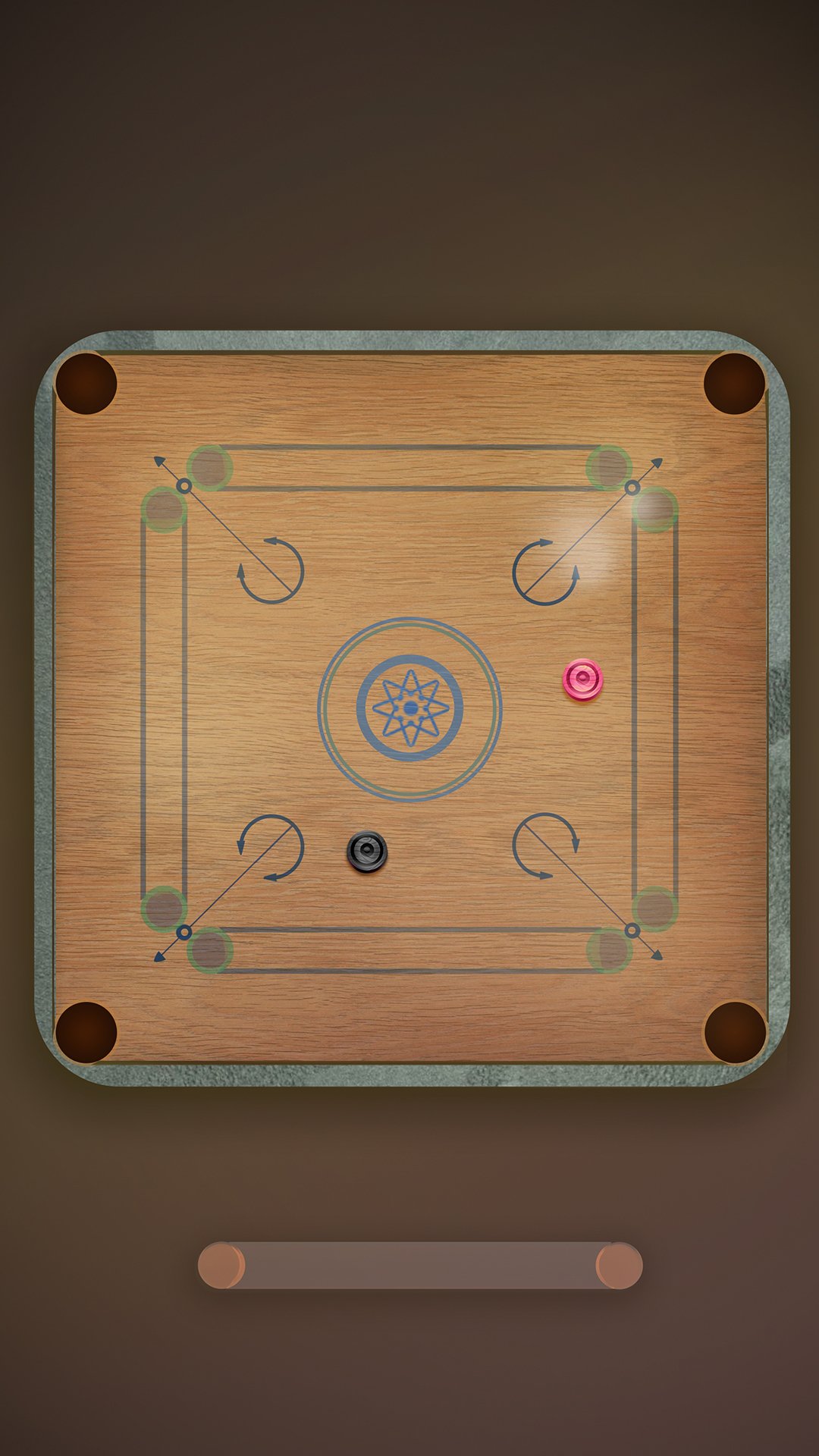
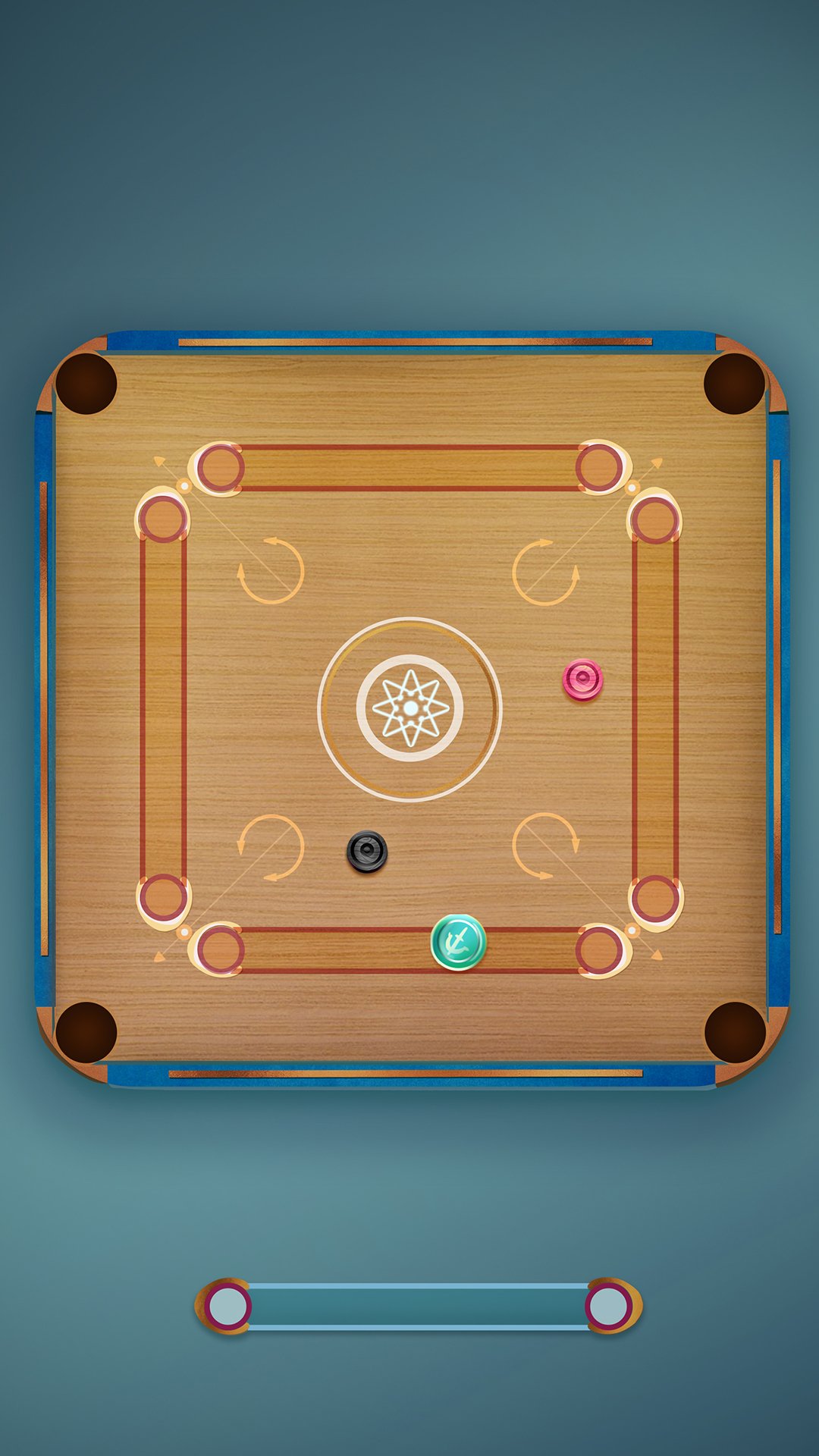
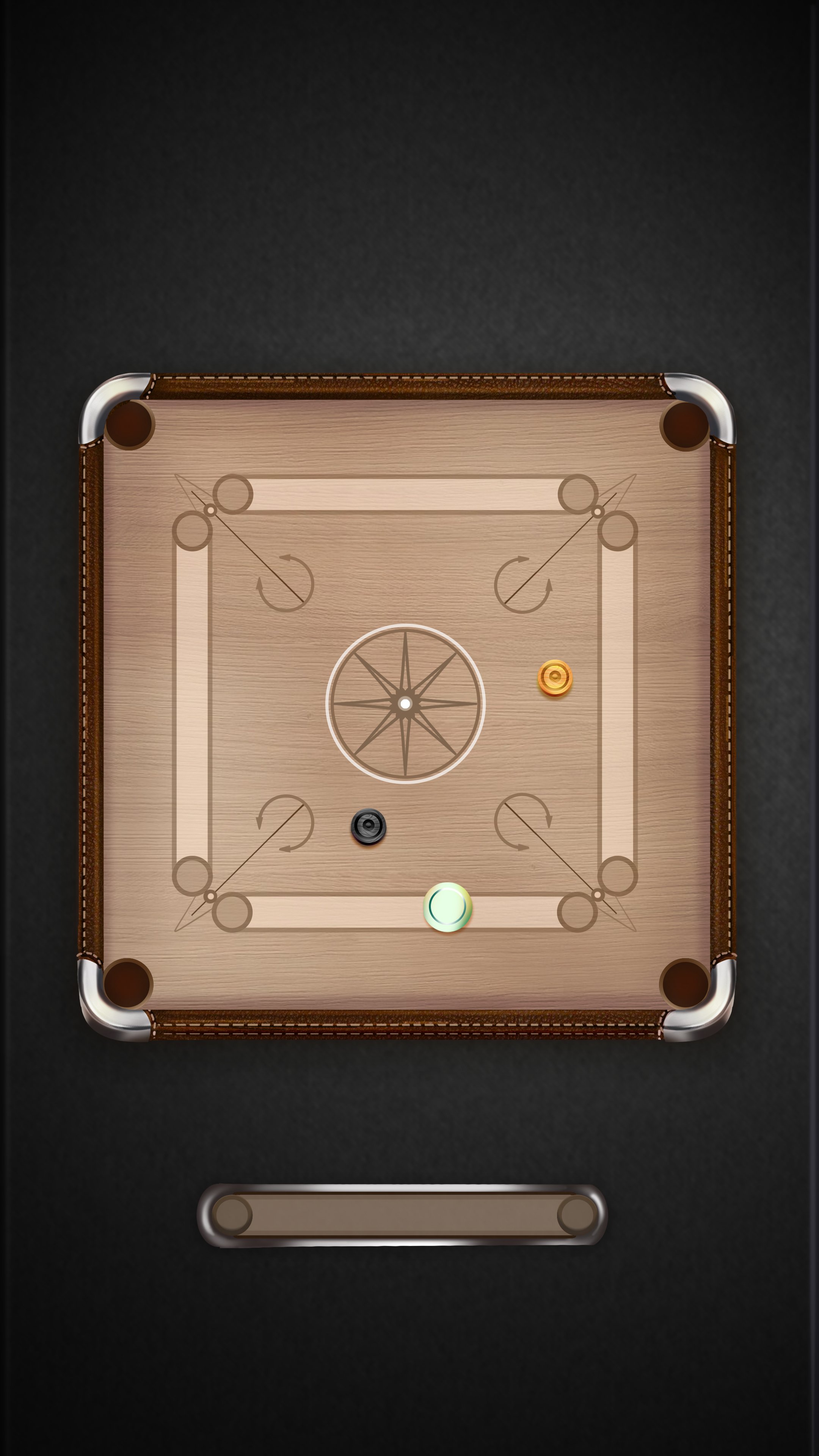
With this 3Dish direction set, it was then a question of dishing out several cool looking boards and we simply loved producing several skins.
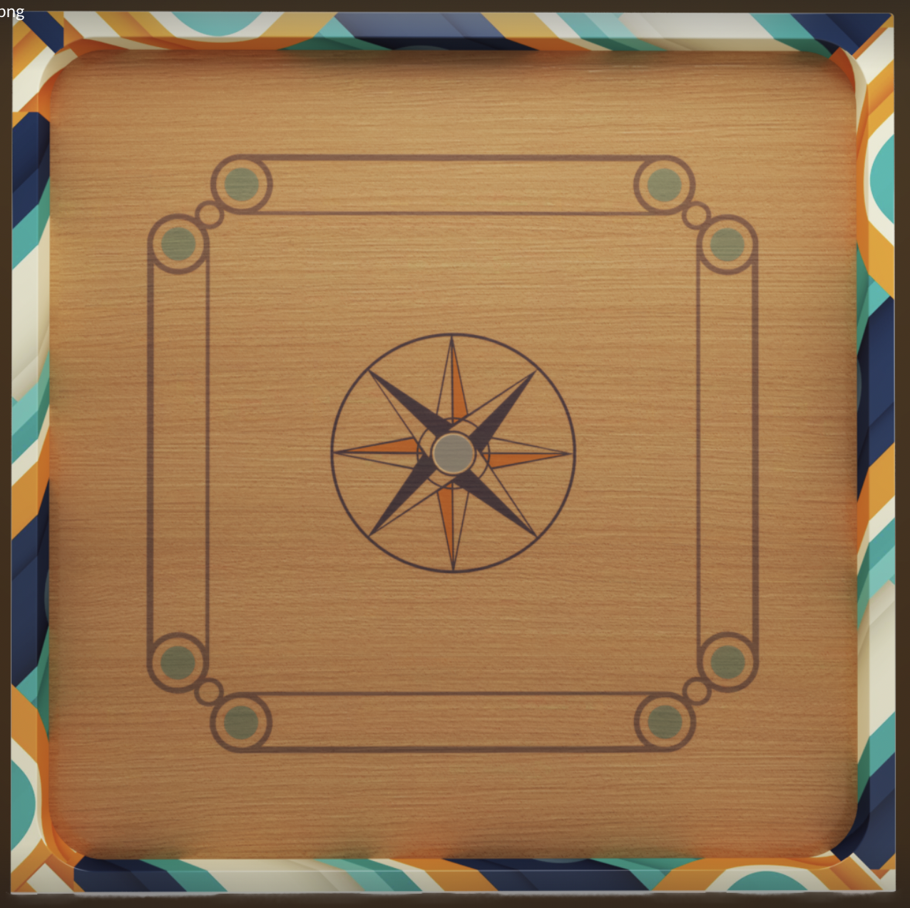

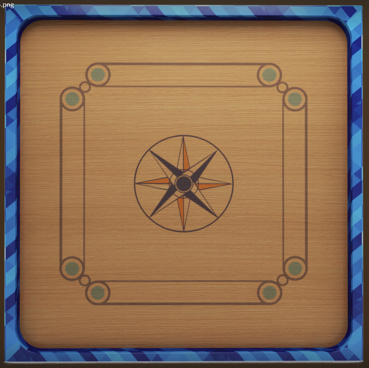
Boards Galore! Ignore the absence of Pockets (we add them separately you see!)
ui direction
The leather trim sounded a good underlying theme for the UI and we tried to incorporate hints of that in the UI panels and buttons. We were clear that the game needs to sport the best UI possible and we did take the time to nail the icons, panels, buttons and what not!
We looked for inspiration all around and toyed with the idea of making the buttons, panels look more like objects that we can touch and feel. The materials needed to feel exquisite and high end giving a very rich outlook to the game.

One of the first examples our AD Sarath referred to and we really like this direction. You can almost feel the leather and the stitches on it. This set the tone to the game’s UI direction.
In parallel we were off to visualize some logos for the game. We knew we were calling the game ‘Carrom Play’ - You see it sounds like Hammerplay!
Some of the early logo renditions. Needless to say we weren’t anywhere near happy with them. The second one was heading in a better direction that we decided to pick up and refine further.

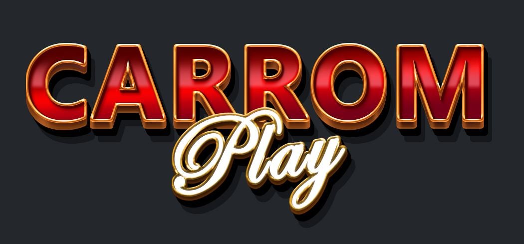

Final renditon of the logo integrating the queen puck and a nicer style for the word ‘Play’
The direction further evolved and we began to flesh out the UI screens based on the wireframes. This was very crucial as we began to see the game taking shape outside the gameplay.


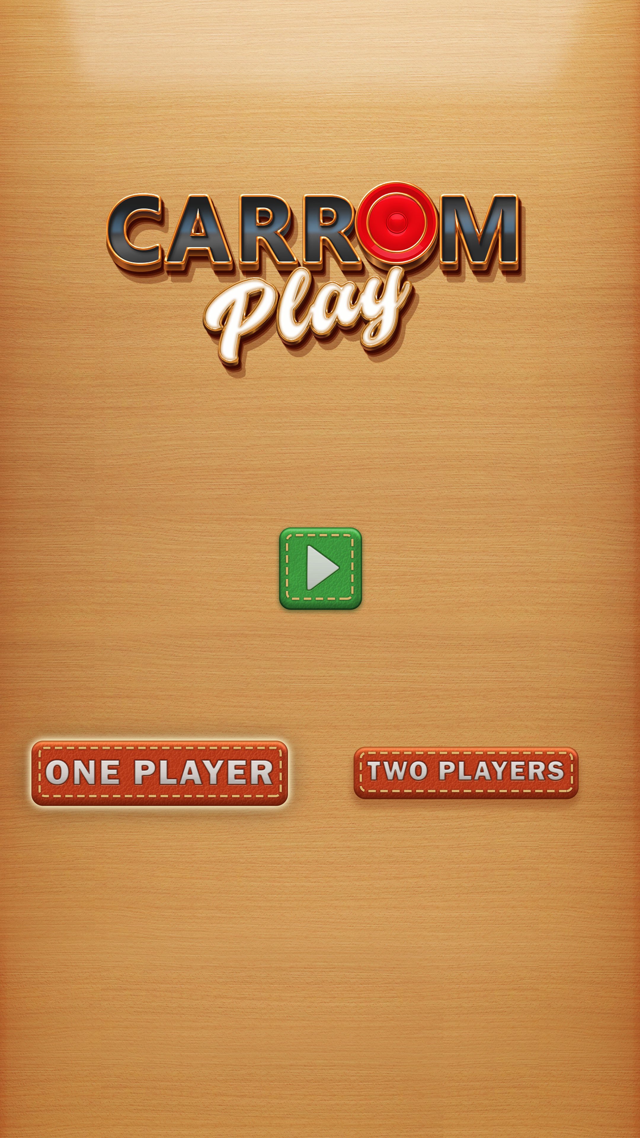
First round of UI mock ups. We also began visualizing gratification popups, score pop ups and other HUD elements.

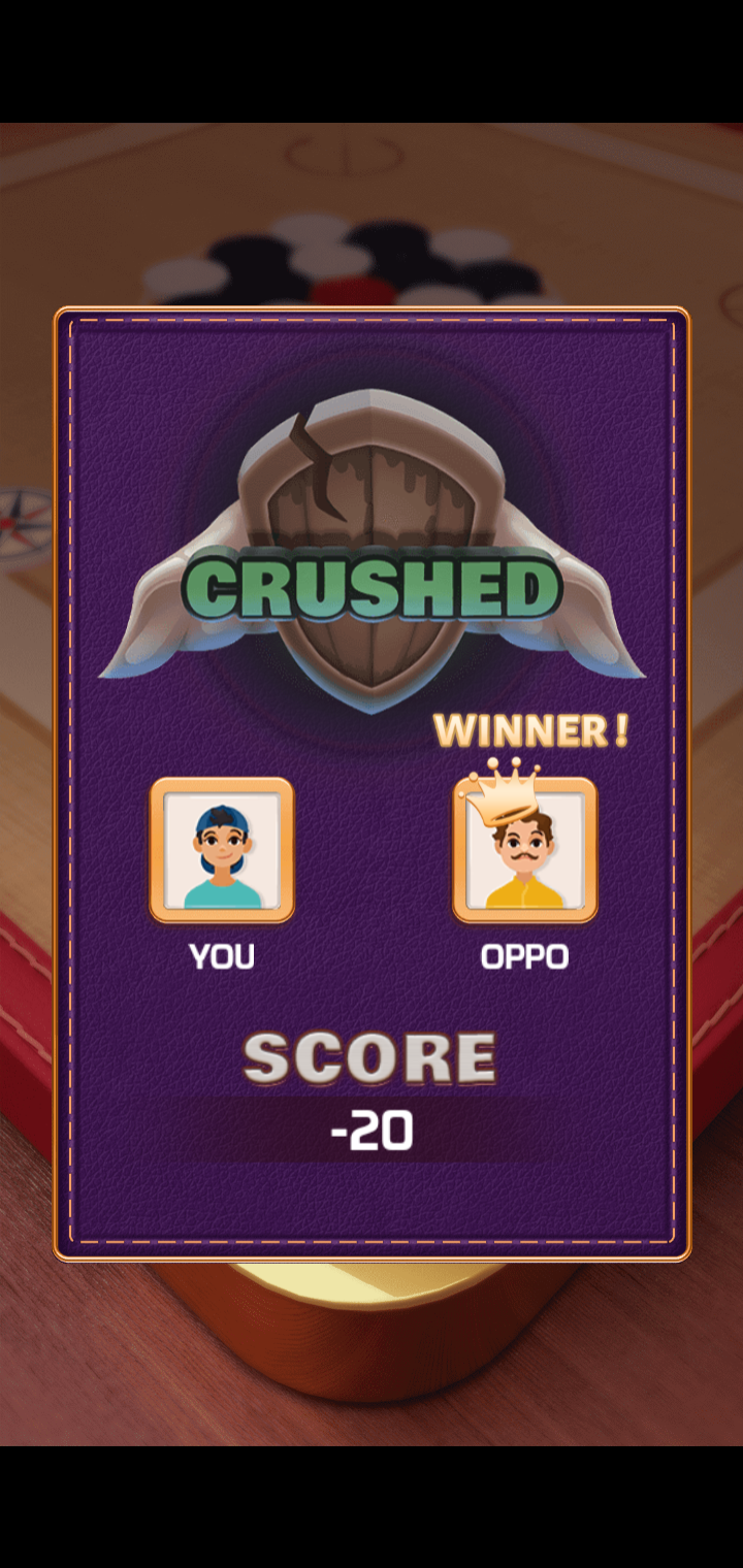
Adding some drama to the score screen with some nice Icons for the Win/Lose scenario. The icons slam in real nice!


Visualizing in-game UI animations

The UI direction in all its glory- Notice the subtle Golden trims and stitched leather effect on the buttons


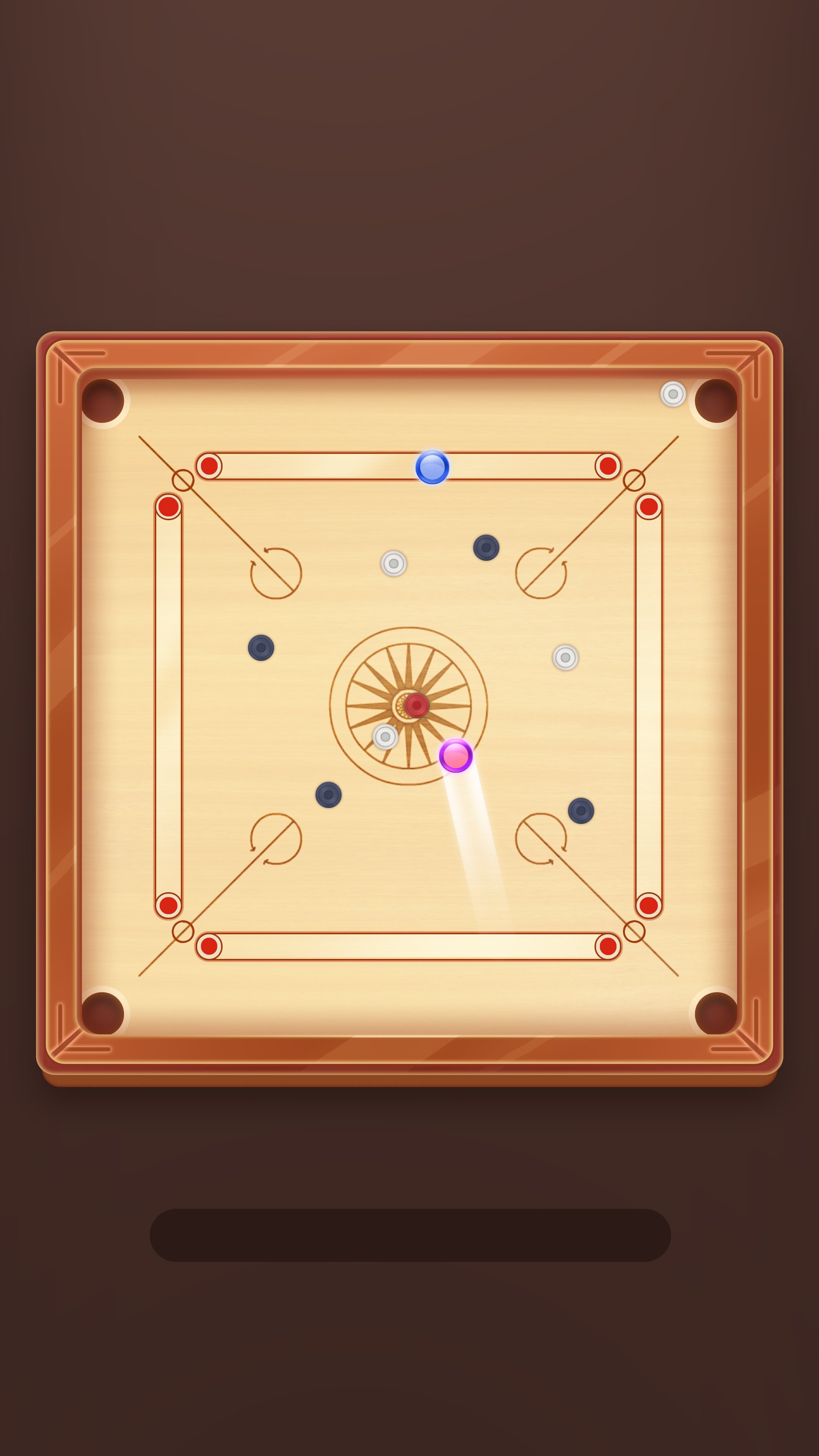
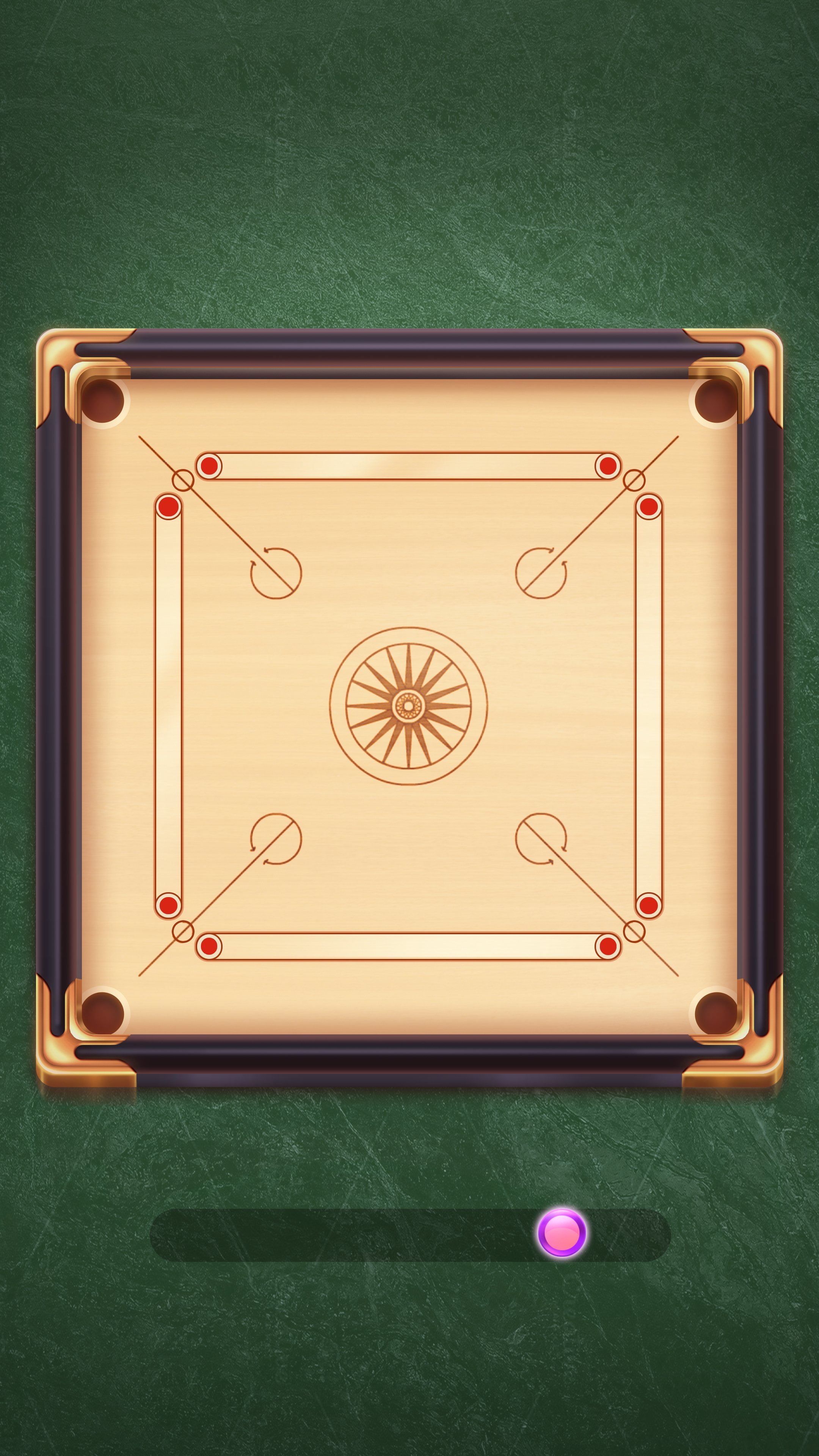
Physics for the WIN!
One of the most crucial things in building a refined carrom experience was obviously a solid physics that feels authentic enough without feeling too ‘Sim’ like. We originally implemented a canned physics system that did the job. While it still feels nice, it doesnt quite cut it when it comes to playing some pro level shots that enthusiastic players come to appreciate. For instance making that 45 deg cut wasnt quite feasible in a canned setup so we had to think of a physics system from the ground up.
Prototype of the Box 2D physics we implemented. The result- Nice and smooth allowing for some very precise shots!
backgrounds
Another area we really wanted to Amp up the presentation was the Backgrounds. We felt there was a great opportunity to bring in thematic backdrops and not just have a bland/ flat colored background. Unlike other Carrom games where the locations are only shown as icons, In Carrom Play we take it all the way to portraying it in the backdrop. This also linked well with the idea of giving users unlockable backdrops. For the current lot we are designing backgrounds representing various cities from India capturing the key elements. We plan to make several such cool backdrops and link them to more of a Arena based progression and still allow players to unlock/ purchase their favourite locations. Want to play Carrom on the Beach ? we got you covered!


Ah! our home town in Carrom Play- Notice the Idly Vada and the Filter Coffee up there?
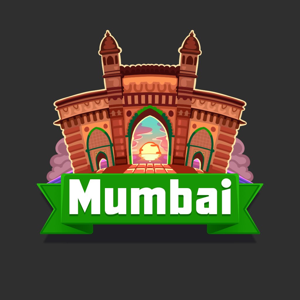
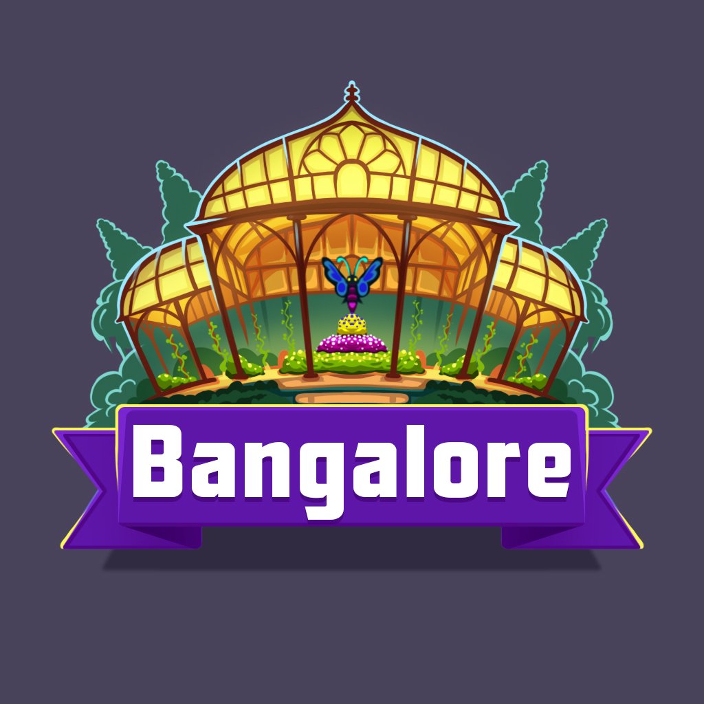
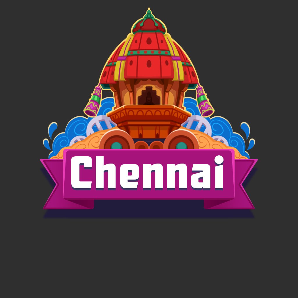
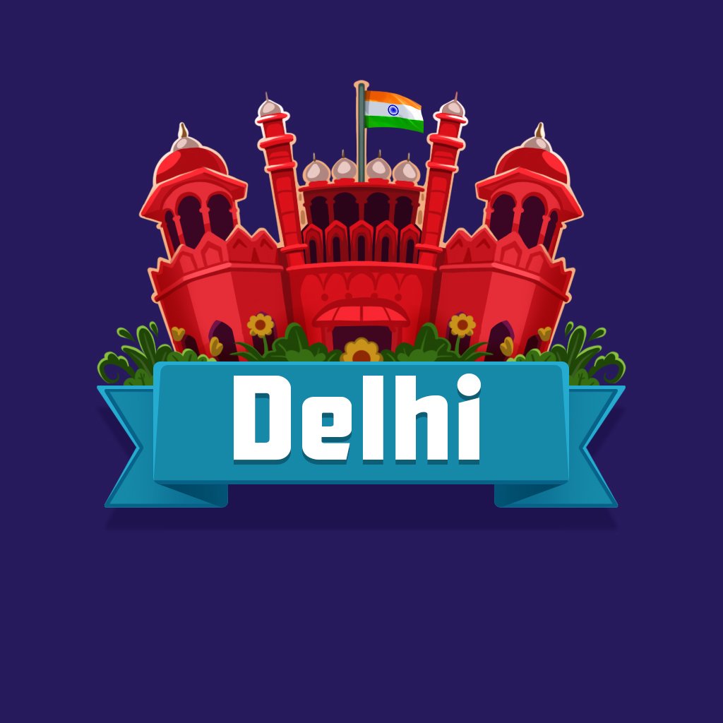
Iconic Icons!
Of course each of those locations are represented by fancy icons exhibiting the iconic landmarks . This is what players see in the UI menus so by all means we made them as detailed as possible while making it inviting.


The Backgrounds idea allows for some custom events too. In this case, a Diwali Edition!
You play with a variety of strikers and pucks in the game. While the Pucks dont carry a functional advantage, Strikers do so and it makes or breaks the game experience. You start off with a stock striker and can upgrade to some very nice Strikers that can send shock waves on the board and destroy the opponent.

Some of the Glorious Strikers you can unlock in the game. Most of these are smooth and powerful!

Some lovely pucks to choose from. No more boring stock pucks!
Well, its an icon but it still needs to be super slick!