
Part 1 - A look at the Art behind the game

How it all started!
We always wanted to build a multiplayer shooter. The moment any studio thinks of a shooter, the fanciest of the games come to mind. We are so influenced by shooters like Counter Strike, Call of Duty, Battle Field, Team Fortress 2, Overwatch to name a few. With the mobile landscape its always a challenge to build such degree of games especially for smaller studios like us. The idea of building a top down shooter has always lingered in our minds. There is something about that presentation that makes it much more fun and accessible. Top down shooters + Mobile is sort of a match made in heaven. They work well and more than a dozen good games out there in this genre and presentation are a standing testament to that! We lacked the right timing to build such a game except for experimentation here and there. The Covid lock down sort of pushed all of us out of our comfort zones and we were geared to build a top down multiplayer shooter that we wanted the masses to play. 3D wasn’t a choice as we wanted to game to be super light and nimble. Games like Synthetik, Super Animal Royale gave us a ton of inspiration and confidence to push towards that direction. The core idea was to build a simpler multiplayer Battle Royale that people can enjoy in quick snackable sessions without the complexities of higher end games. A 16 player battle where people jump into their desired zones with pistols as their default weapons, grab a powerful weapon they can find in the immediate sight, shoot, survive and become the winner- Thats it! The game also gave us a tremendous opportunity to set it in an Indian theme with the characters and world seen from the daily walks of life. The game really lends itself to the Indian theme naturally as it made logical sense to have fun looking Indianized characters in their natural habitats, the Indian villages, towns etc.
With that in mind we set out to flesh out some initial round of concepts. We took the idea of top down a notch seriously and tried to concept the characters in multiple directions. We really liked what we saw but in game development form needs to meet function.

The first round of explorations we did with the character design in that top down/ ISO multi angle view.
We sort of pushed in this direction only to later realize that its going to be a pain to make it work seamlessly for a shooter. What works for an RPG, Adventure type games, doesnt really work for a shooter. So we reverted to the idea of front facing characters that can be placed in a top down world. The world has that dimensional feel while the characters are flat out sticking over the world. Again something that has always been done in such type of games from ages.

The top down presentation of the game - Synthetik (we loved its art style and presentation)
Super Animal Royale (SAR) was hugely inspirational and continues to do so. One slick game!
We also began the world design explorations in parallel and went through several designs and iterations.

First round of world concept explorations
The illustrative shading we saw while was good, we didnt want to make the game look like an adventure or an RPG so we went back to the drawing board and tried something a bit more simpler and clinical.
Back with the character we had more concept explorations coming in from our talented ADs. They really did let themselves loose and had a blast. One of those things thats really important in the early stages of development is to ensure that the team has the creative liberty and sense of autonomy so they can quickly iterate and make some informed decisions.

Simplistic character designs - That’s what we are talking!
With the found approach we further began to push on this direction to achieve a benchmark character design and we just did that in the subsequent rounds. A good character design is nothing short of magic. Its got to bring that smile in everyone’s faces and the next design just did that!
One of the first designs was around this character called Sigham (borrows from the famous movie Singham) and the character itself was modelled after that typical Police Constable or a Sub inspector we are used to seeing sporting that huge pot belly and massive Mustache (That the infamous Veerapan sported) We wanted that grumpy look in the face too that again we are used to seeing with such characters from real life.

Birth of Singham!
The Aha moment for all us and we further pushed this direction.

Singham’s first glimpse in full glory
For the later part of the designs we adjusted the view of the characters so they are a lot more front facing so we don’t lose out on the face details.
The world design continue to evolve and we started to look at favorable directions.

One of those first set of designs that evoked the right feeling for us
On the other end, our character designs began to take shape. We were looking to make them production spec ready early on so we know how they would work when they are rigged and animated in Spine 2D. The challenge is to paint and separate those layers that work seamlessly when animated without losing that visual fidelity.

Singham straight on and ready for action!

Exploded view of Singham - Notice how the production spec character now looks straight on
We continue to establish the art style for the environments. With the world we wanted to the tone that represented that Indian look best. We didn’t want to make them look muddy and wanted to keep a certain standard of colors so they look broadly appealing. The idea of loose brush strokes in the environment assets was appealing and we went ahead with that.

Brushed strokes on the Assets

The production spec environment art! Notice the painterly details on them.
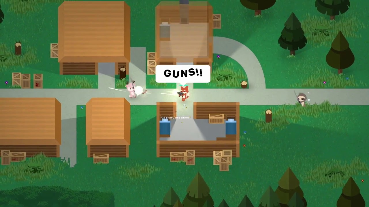
This was also the point where we began to integrate the characters into the world and tested how well they worked together. It had to have the right balance of and not look too Juxtaposed. With the initial green flag from the internal team, the art team went full steam on the assets needed for the map.
And here is the pieced up game in action with the characters and locations in their full (well almost)glory. There is so much more to refine and polish but this was one of those directions we were happy with.
To be continued….. (hopefully!)